Thought: In this project we will use our sketch from Part 1 to create a finished work of art.
Project: We will use oil pastels to create a portrait of a tree in the early part of spring.
Age: Grade 2 up to adult. This project can be done in the art classroom or adapted as an at-home project.
Materials: a standard size piece of nice art paper (either 8″ x 11″ or 9″ x 12″ will do); a set of oil pastels; a pencil; a paper towel for cleaning the pastels and hands along the way (paper towels can be used as a blending tool as well.
Steps:
1) Using a pencil, carefully re-create the shapes and lines of your tree; try to preserve the proportions of height and width. Work in all of the details, and include the horizon and any objects in the vicinity. Always remember that the tree is the “main character,” though.
2) I did my first version using oil pastels. Here is a brief summary of the progression:
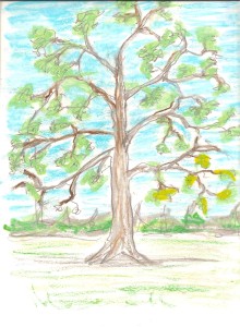
Here I’ve begun to put small areas of light blue around the branches and leaf clusters. Notice that I’m leaving some white space as a buffer. I’ve also added some light gray and a bit of brown. This is more a quick distribution of areas of color rather than “coloring in” fully.
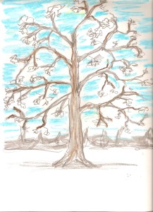
Now I’m adding some white oil pastel to the blue. I’m putting more blue toward the top of the picture, more white toward the bottom.
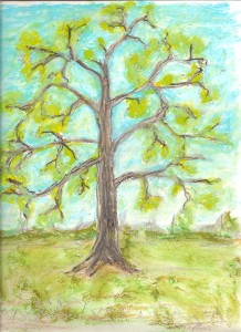
 I’m also adding light green to the leaf clusters, followed by a nice yellow blended in with the green.
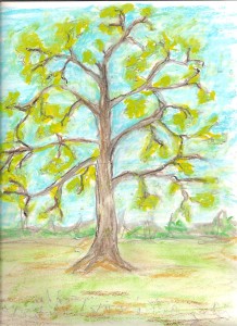
In the third picture, I’ve continued to fill in spaces between branches and leaves with more blue in the top half, more white in the bottom half. I’m adding a tiny bit and black to the tree trunk and branches, to make them look more solid. I’m trying a variety of colors to represent the ground, trying to avoid taking one shade of green and filling in the bottom part of the picture with it. Taking our cue from observation, I want students to register that they’re looking at a variety of colors everywhere.
3) A white oil pastel is worth its weight in gold, because you can use it to blend with colors to make them lighter. Since oil pastels are heavier, you could take this project in an almost-Van Gogh direction, putting in swirls of color if you like.
4) Note the color of the woody parts of the tree. If you leave students to decide what to color the tree trunk and branches, they will routinely color it brown. But, remember! We’re doing this tree. Our tree is gray with a small bit of brown. I’d model blending white with a bit of brown and some black and go from there! I believe in testing colors on a scrap piece of paper before applying it to my final project.
5) Finally, I add the leaves. Try to discourage students from hammering away on their paper with ineffective dots. Encourage pushing the oil pastel and twisting a bit. Most oil pastel sets have two or three different greens. Try to find the greens that come closest to the actual leaf color. In the early spring, many leaves have this delicate light green color. Problem-solve how to represent that color with the tools you are using.
NOTE: Observe how this is working / not working for the class. You may want to try it again using different materials.
Have fun with this and let me know how it goes. I would love to share your tree art with the world on this site!
Save your sketch, because we’ll be using it with pen and watercolor in a few weeks.


Recent Comments